Logo Redesign | T-Shirt Design
Logo Design For a Running Club
Club Overview
Arunners is a running club based in West Sussex who needed a rebrand as well as a new design for the training t-shirt. They meet on a weekly basis in Littlehampton, as well as train for marathons and take part in races throughout the year.
Logo Redesign Process
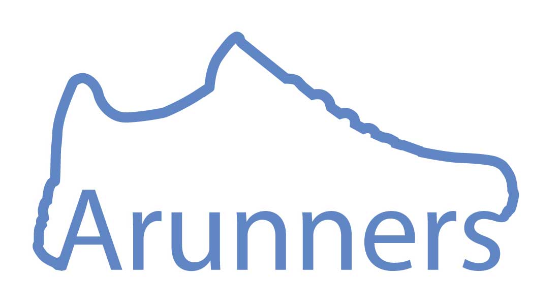
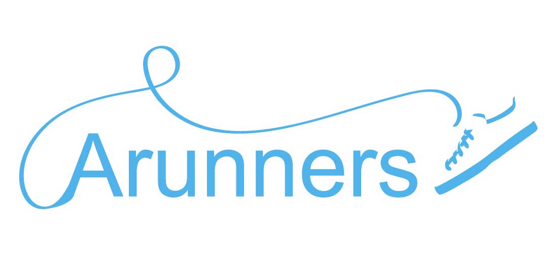
Arunners were looking for a complete redesign of their logo. The initial request was for the logo to incorporate the name, shoe imagery and have a bold colour. We initially began linking running shoes into the name of the club. However, after creating a few designs, both Arunners and Scorpio Digital decided dropping the shoe imagery and focussing on just the text would create a stronger result.
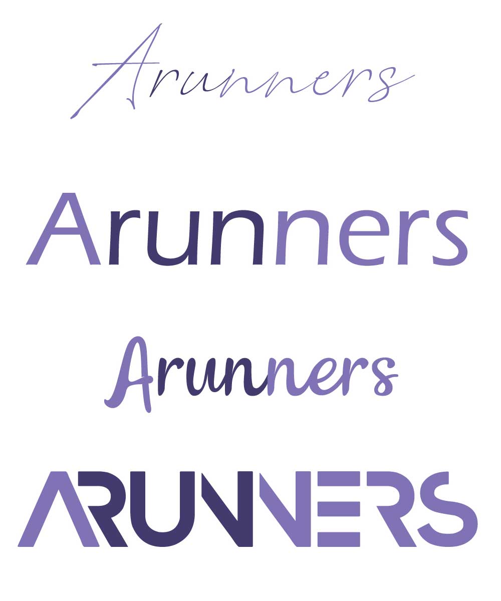
After looking at different text designs and highlighting the word run, we were able to get a clearer picture of what the logo could look like.
Final Outcome

T-Shirt Design
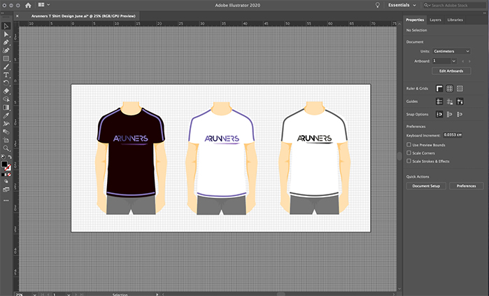
As members of Arunners are a mix of men and women of all ages, it was important to design a team t-shirt that would suit everyone. It had to have a colour scheme that would appeal to all. Therefore, this meant the t-shirt needed to be a light colour so the runners could stay cool, rather than wearing a dark top that would absorb the sunlight. However, on the other hand it was important that the chest area of the t-shirt wasn’t too light as they had previously found lighter t-shirts became slightly see through, which wasn’t practical.
Furthermore, there needed to be two designs for members to choose from, hency why a black and white version was created. Despite being dark, the black option was a potential option for a winter kit.
